During the 1930s cruising became increasingly popular and an important revenue for Cunard. As a result the company used a variety of ways to promote travel on their ships. Using original posters from the Cunard archive, Graham Gladden takes a look at how one of the longest-serving names in shipping history promoted its services across the world.
Cunard and its advertising
From its very foundation in 1840, Cunard held passenger safety at the heart of its operations. Unlike some of its rivals, arriving was more important than getting there quickly. It proudly proclaimed never to have lost a passenger through an accident at sea. As the 19th and then the 20th centuries progressed, the company also became known for the luxury of its ships. Whilst First Class would always be the ultimate, the development of a tourist market in the interwar period meant high levels of service percolated to other classes. Passengers found themselves experiencing food and comfort far beyond their on-shore norm as they travelled to places previously only the purview of the wealthy.

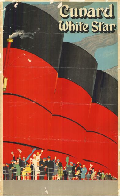
All these elements can be found in Cunard’s advertisements and other marketing communications. For example, safety, whilst never mentioned specifically, is connoted by huge red funnels (as symbols of ship’s ability to cope with the vagaries of the ocean). They provide a background to the mass of happy, relaxed passengers on the liner’s deck. Promoting exotic destinations was an important element of Cunard’s advertising, somewhere to be visited on a cruise or after several days’ travel. This changed after WWII with the growth of the airline industry. Now holidaymakers could choose the mix of time on the journey and at the destination. To counter this, Cunard, promoted the voyage as an integral part of the holiday. In the 1950s a series of advertisements, “Getting there is half the fun!” encouraged potential customers to value the time at sea with its entertainment, comfort and excellent food.

Cunard White Star poster (D42/PR11/23) 
Cunard White Star poster (D42/PR11/10)
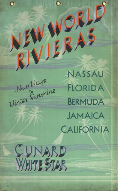
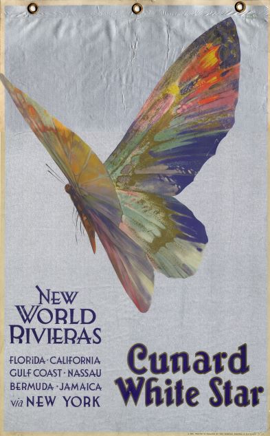
The two New World Riviera posters are interesting examples of Cunard advertising. The company encourages a trip to winter sunshine. The font for the main text suggests modernity – this is the place to go and the way to get there. The gently coloured background of sea and palm trees hints at the warmth and relaxation to be found on arrival. The second poster, with its spectacular butterfly is an enigma; it’s quite unlike any other poster of which we’re aware. So, if you can shed any light on it, SCA would love to hear from you!
If you would like to read more about Cunard’s marketing communication, Graham Gladden (Visiting Research Fellow, LJMU) has written the following papers:
- “Marketing ocean travel: Cunard and the White Star Line, 1910 – 1940, Journal of Transport History 35:1 (2014), 57-77.
- “Post Second World War trans-Atlantic travel for business and pleasure: Cunard and its airline competitors, Journal of Transport History 41:2 (2020), 160-183.
- “Maslow’s model of needs: application to Cunard and White Star marketing communications between 1900 and the 1950s, Journal of Historical Research in Marketing 12:3 (2020), 323-344.